100 years of the Maple Leafs logo
The new Toronto Maple Leafs logo for the 2016-17 centennial season.(Designed by JORDAN CASCHERA)
In preparation for their 100th season the Toronto Maple Leafs have unveiled a new logo.
Maple Leafs fans are used to change. The team is constantly fluctuating with players coming in and out of the organization but for the better part of 50 years, the one thing which has remained relatively the same is about to change.
To many, the current sacred blue and white crest is a reminder of a great historical team. It’s the logo I’ve worn on my jersey my entire life, but nothing is really special or historic about it. The Leafs have never won a Stanley Cup with this current logo or made a serious run with it – beside the Matts Sundin and Doug Gilmour era of course.
The more time goes on with this logo, the more it starts to remind me of disappointment and the organization is trying to leave all the negativity behind with this current rebuild.
So I say bring on the new logo. Change is a good thing.
The end of what was debatably the worst season for the Leafs last year came with a bitter sweet overhaul of upper management. We saw former Detroit Red Wings winger, Brendan Shanahan, promise fans the beginning of something great after his hiring. He backed his promise up with the signing of now-former Detroit Red Wings head coach Mike Babcock to an eight-year $50 million contract. Shanahan then hired former New Jersey Devil, Lou Lamoriello, to manage the team.
The new regime of the Maple Leafs promised to overhaul the team after taking control in the off-season, but nobody expected the transformation of the team logo.
The new logo is the beginning of a new-era, the Mike Babcock-era. The Leafs are being rebranded by this new regime and a new look to the team is just one step towards what is supposed to be a five-year multi-step process.
The Maple Leafs logo has always been one of the most simplistic in the league but not in a good way. The start of the 2016-17 season will change that. The logo has a retro look to it, a look which reminds me of a team that was once great, a team with players like Dave Keon, Tim Horton and Johnny Bower.
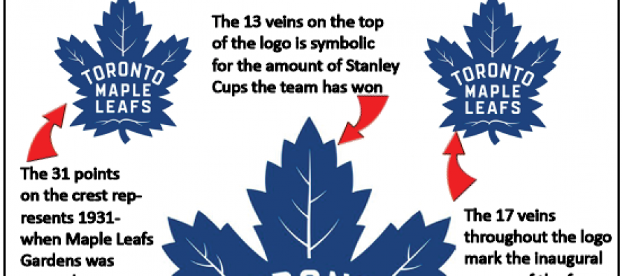
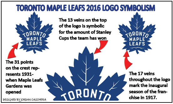
The logo has meaning now, it’s not just a simple logo with the team name inside of it. The 31 points on the crest represents 1931- when Maple Leafs Gardens was opened, the 13 veins on the top of the logo is symbolic for the amount of Stanley Cups the team has won and the 17 veins throughout the logo mark the inaugural season of the franchise in 1917.
The next step in the new look process is a whole new re-design of the blue and white jersey, which is rumored to be unveiled during the 2016 NHL Entry Draft in Buffalo, hopefully with the name Auston Matthews on the back.
The logo is a reminder of what can be and what once was. The only thing fans want is the Toronto Maple Leafs to win and this new logo is a start.

